Redefining a brand experience website and identity

Asset A

Challenge

Update a brand microsite by merging it back into the main brand retail site, creating a more focussed experience while evolving the brand as a unified presence within a fully integrated eco-system across social media, partnership activation and affiliates. Deadlines were tight, so the small team needed to hit the ground running.

Process

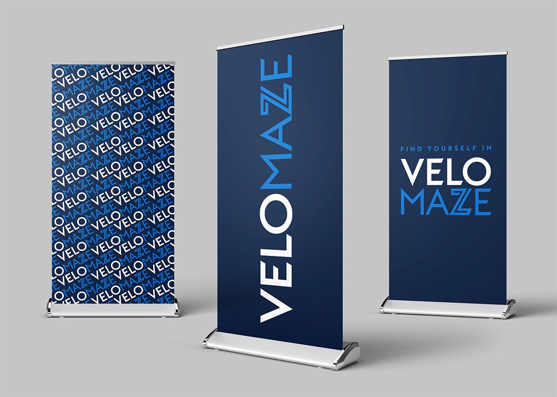
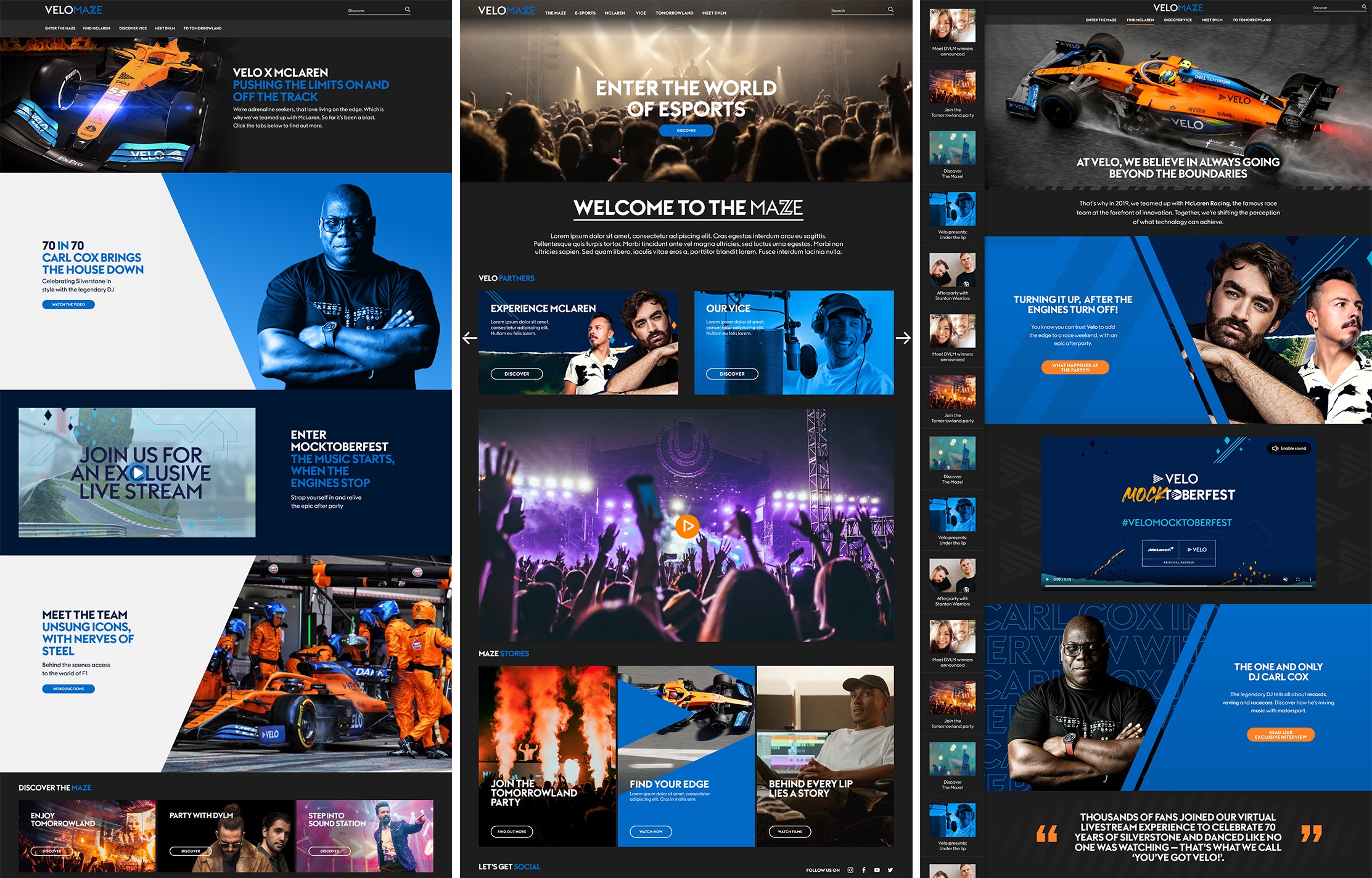
Once familiarised myself with existing research and discovery materials, I dived straight into updating the brand identity. New site designs were created, enhancing existing content across 3 levels of approach led by the build framework - each version stretching the potential further as the full team gauged what was technically possible within the timescale.

Solution

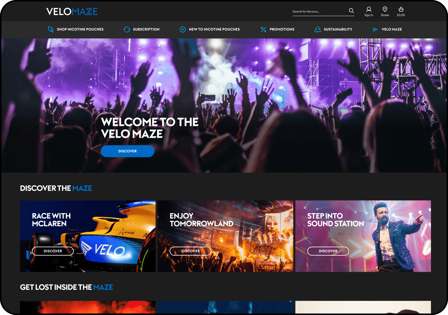
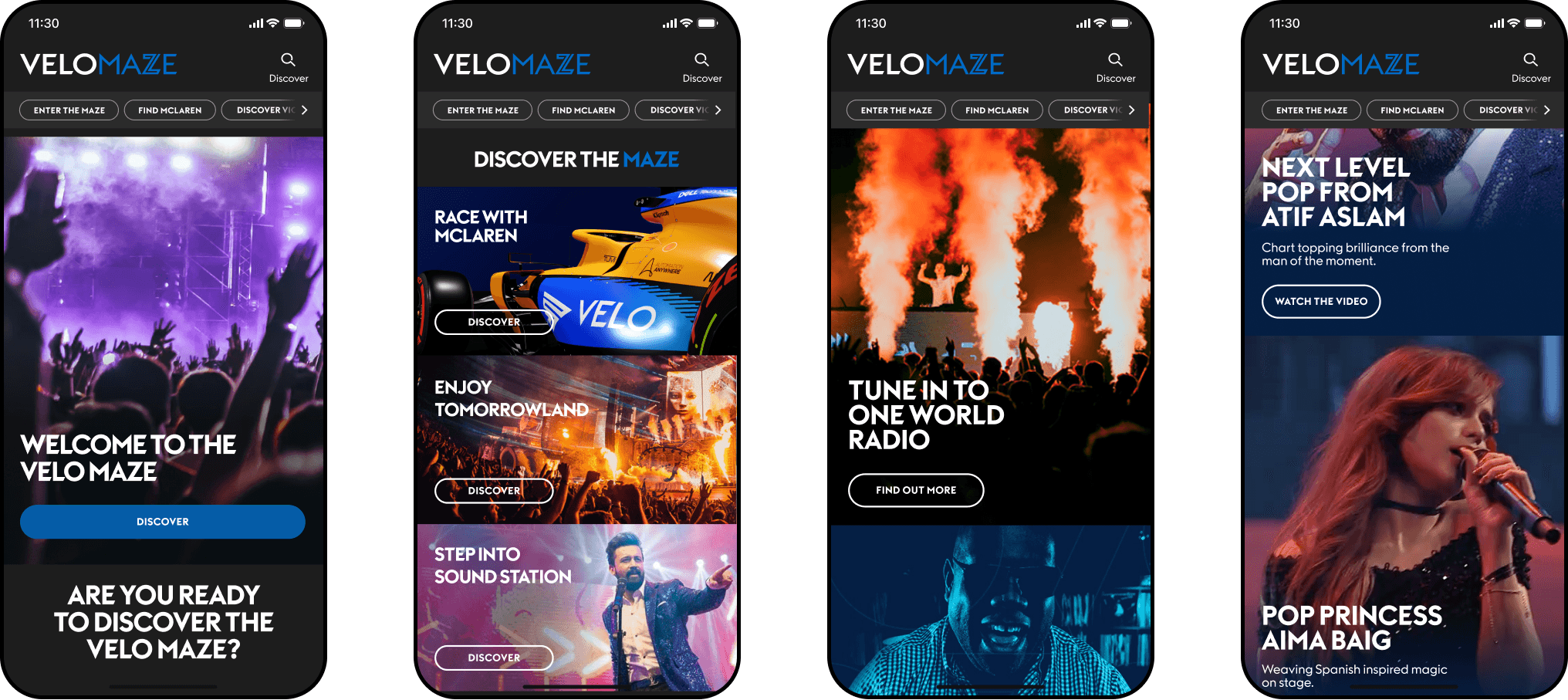
The new brand was applied to ensure brand consistency, and the design that adhered closest to the build framework was selected as the most practical option, while fulfilling the request to have a more focussed experience that didn’t dial down the excitement.

Role

Senior UI/UX Designer

Year

2021

Contribution

UX, UI, Branding, Prototypes

Platform

Web

Asset A
Asset A

User journey

User journey

User journey

Discovery

A partner agency had just acquired new client, BAT, and alongside another designer I joined a small team on a tightly-deadlined project to update an offshoot site to one of their products, Velo, by merging it back into the main brand retail site. The existing site - Velo Maze - was intentionally unstructured, with a moving carousel grid of article promotions with the intention of blitzing the user with content. The request was to have a more focussed experience that didn’t dial down the excitement of partnership activations, and still allowed the user to ‘get lost’ in the experience, but offered it in a more controlled fashion. It was also to be integrated within the brand’s main retail site, which meant adhering to the build platform, Magento 2.

Brand guidelines were supplied, along with all existing research materials, including persona profiles, user journeys and sitemap.

Asset A
Asset A

Old site with client annotations

Old site with client annotations

Old site with client annotations

Readily armed with all the discovery research materials, the decision was made almost instantly that we’d dive straight into scamp visual designs, given the tight deadline we were working to. 

One of the issues of Maze being perceived as a separate brand was the site’s colour scheme, with a unique orange tone dominating. This needed to revert to the brands main blue colour as part of the integration. Content was to remain the same so we’d essentially be reconfiguring what was already in place, prioritising as per the clients objectives. 

Asset A
Asset A

Updated logo design exploration

Updated logo design exploration

Updated logo design exploration

Before commencing any site designs, I took on the task of updating the identity and name hierarchy. The existing identity read ‘MAZE BY VELO’, with main emphasis being on the first word, hence the sub-brand confusion. I initially tried out various ideas and combinations, consciously maintaining brand integrity using different weights of the main brand font. Honing in on 3 favourite ideas, they were and presented and adapted to approval, applying brand colours.

Before commencing any site designs, I took on the task of updating the identity and name hierarchy. The existing identity read ‘MAZE BY VELO’, with main emphasis being on the first word, hence the sub-brand confusion. I initially tried out various ideas and combinations, consciously maintaining brand integrity using different weights of the main brand font. Honing in on 3 favourite ideas, they were and presented and adapted to approval, applying brand colours.

Before commencing any site designs, I took on the task of updating the identity and name hierarchy. The existing identity read ‘MAZE BY VELO’, with main emphasis being on the first word, hence the sub-brand confusion. I initially tried out various ideas and combinations, consciously maintaining brand integrity using different weights of the main brand font. Honing in on 3 favourite ideas, they were and presented and adapted to approval, applying brand colours.

Asset A
Asset A

Brand placement

Brand placement

Brand placement

The selected version referenced the structure of the 'V' in Velo's own identity, while also being suggestive of a maze-y pathway, and I created a presentation document with validatory guides to clarify the intention behind the idea. I mocked up a few implementations of the logo into real-life Velo scenarios to give the client a flavour of how it could work.

The selected version referenced the structure of the 'V' in Velo's own identity, while also being suggestive of a maze-y pathway, and I created a presentation document with validatory guides to clarify the intention behind the idea. I mocked up a few implementations of the logo into real-life Velo scenarios to give the client a flavour of how it could work.

The selected version referenced the structure of the 'V' in Velo's own identity, while also being suggestive of a maze-y pathway, and I created a presentation document with validatory guides to clarify the intention behind the idea. I mocked up a few implementations of the logo into real-life Velo scenarios to give the client a flavour of how it could work.

Asset A
Asset A

Design variants pushing the components and framework

Design variants pushing the components and framework

Design variants pushing the components and framework

We were briefed on the build platform, Magento 2, by the technical project manager, who helped define the possibilities and limitation of the available modules. It was decided that we’d offer a few design ideas, pushing the boundaries of the platform a little further each time, being conscious that time was likely to be the decision maker ultimately.

An early decision was made to flip the tone of the main site’s predominantly white surround, to a darker grey, while pulling in the use of the brand blue that straddled both tones. Part of the same experience yet darker and more mysterious.

We used existing feature content, a combination of promotions, interviews, product features and brand partnerships, enhanced with new styles and structures.

We created second and third phase designs which pushed the framework further each time, creating prototypes for all versions, showing how various pop-ups and interactions would work, always returning to the idea of getting lost in the Maze, a concept the client was keen to push despite the structure becoming more linear and standardised.

Asset A
Asset A

Selected design detail

Selected design detail

Selected design detail

Ultimately it was decided the simplest structural version was most practical, as anticipated due to time restrictions. The agency had shared access to the Figma designs, so within the tight schedule we completed handover for the development team to implement updates. A super-quick and focussed job, benefitting from an all-hands-on approach and helped along with daily stand-ups and show-and-tells to ensure we were all regularly on the same wavelengths.

Ultimately it was decided the simplest structural version was most practical, as anticipated due to time restrictions. The agency had shared access to the Figma designs, so within the tight schedule we completed handover for the development team to implement updates. A super-quick and focussed job, benefitting from an all-hands-on approach and helped along with daily stand-ups and show-and-tells to ensure we were all regularly on the same wavelengths.

Ultimately it was decided the simplest structural version was most practical, as anticipated due to time restrictions. The agency had shared access to the Figma designs, so within the tight schedule we completed handover for the development team to implement updates. A super-quick and focussed job, benefitting from an all-hands-on approach and helped along with daily stand-ups and show-and-tells to ensure we were all regularly on the same wavelengths.

Asset A