Designing a solar panel discovery-to-purchase experience
Challenge
Working with OVO Energy as a contracted Senior Product Designer on their new solar panel customer experience, my task was to create the full end-to-end journey from initial customer awareness, commitment to purchase, to post-installation. There was a tight schedule to release an MVP version of the online discovery and guide price flow by the end of Q1, with fast follows for the remainder of the journey through to payment, to ensure a smooth process for the earliest adopters.
Process
After a swift on-boarding, I reviewed existing early discovery work and began workshopping ideation sessions with various team members. Wireframed ideas were created and presented, early design flows user-tested, and ultimately enhanced utilising the existing design system while creating new components and design patterns.
Solution
The online experience was integrated into OVO's main website, seamlessly integrating with their marketing touchpoints, creating a low-friction flow that ultimately encouraged customers to convert and for business requirements to be met. Further assets and flows were created to ensure brand, style and experience consistency within the full user journey.
Role
Senior Product Designer
Year
2023
Contribution
UX, UI, Research, Prototypes, User testing
Platform
Web

Solar Customer Journey
Solar Customer Journey
Solar Customer Journey
Research
Initial work had already begun with a few workshops and early formative user research, and I was on-boarded to the product, brand and sector. Existing in-depth Service Blueprint and Customer Journey maps highlighted the flow as it was at that point, and revealed the complexities and inter-dependencies not just within OVO, but also of 3rd party partners and products.
From here I carried out in-depth competitor research, helping embed myself further within the sector and product area. As we were dealing with the full purchase flow, research into finance and payment methods were also crucial.
Early user research notes
Early user research notes
Early user research notes
The 4 stages of the buyers journey were defined as Awareness, Consideration, Purchase and Install, and the challenge statement refined to ask:
For home owners, how might we ensure the solar experience from first interaction to install is simple and easy, so that customers feel suitably reassured to transition to renewable energy with OVO, to power their homes and reduce their bills in a self-serve way?
Early user research uncovered thoughts and needs of potential customers who’d registered their interest in solar with OVO. Our experience was to be for all potential customers, OVO and non-OVO alike, so the platform for the discovery flow was non-logged in web and mobile, with no pre-populated data at our disposal.
Mobile wireframes with low friction cost calculator process
Mobile wireframes with low friction cost calculator process
Mobile wireframes with low friction cost calculator process
Challenging design patterns
In a working session, we took an opportunity to question and review the peak aspect of the consideration flow; eligibility check > cost calculator > indicative quote, which was a common approach for our main competitors.
This process seemed fairly formal and restrictive, and was generally framed by competitors as a means to getting a personalised quote, pushing the endowment effect. But it doesn't come without it's friction, and as we knew, the quote at this stage is really just a rough guide.
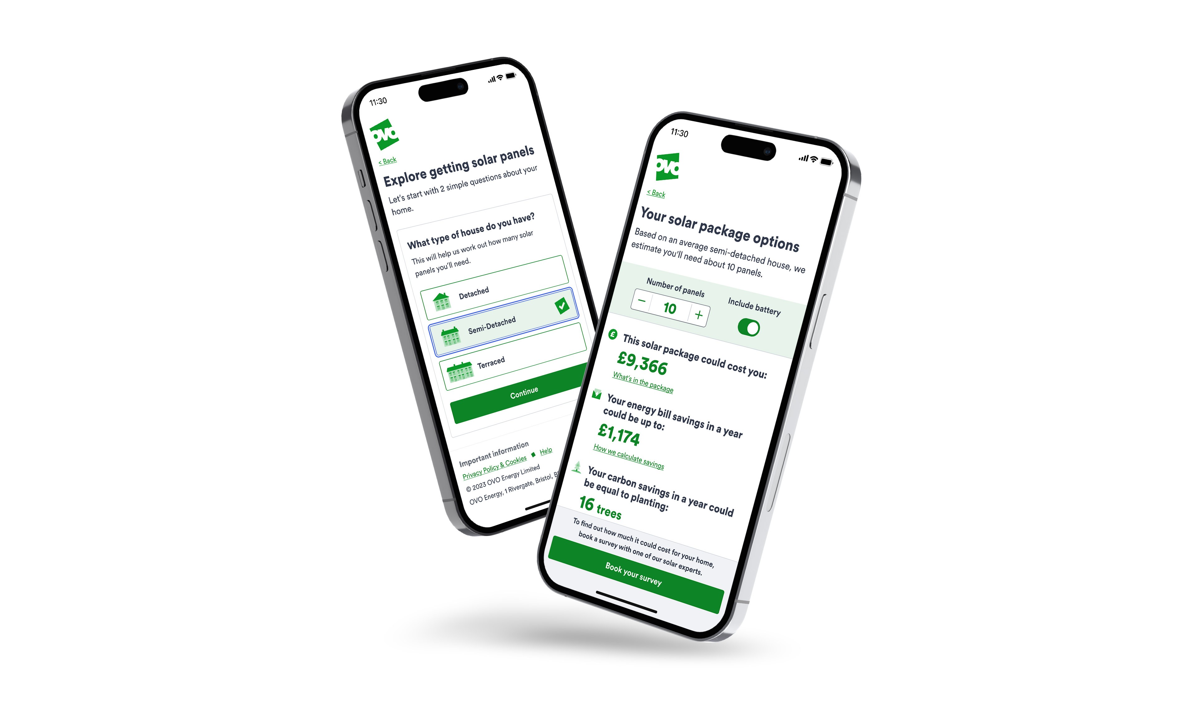
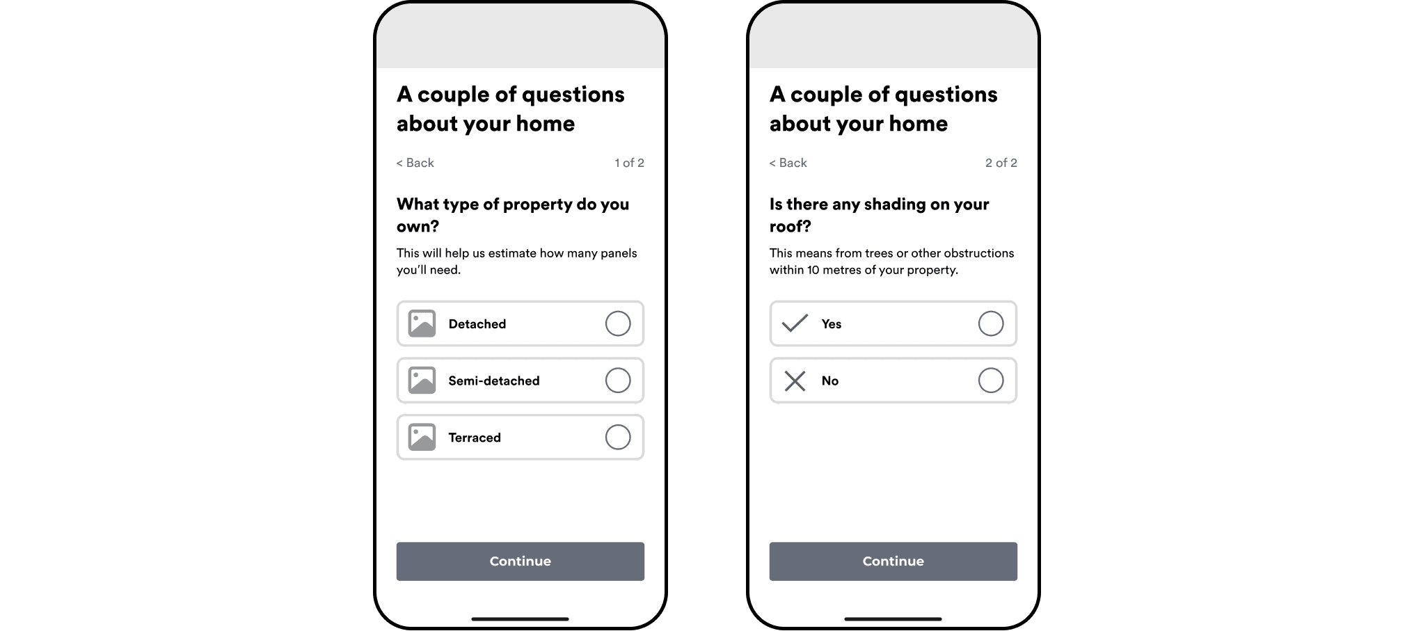
We decided to keep the questions to an absolute minimum, and ask just enough to be able to suggest a solar package suited to the average property type of the customer, and to give a guide price and savings. We also moved the eligibility check from the start, to ensure ease of discovery for all customers - why shut out the solar curious so soon?
And so we started the flow with just 2 simple questions about the users property - no request for addresses or user information, and a guaranteed way to be offered a reasonably accurate quote.
Challenging design patterns
In a working session, we took an opportunity to question and review the peak aspect of the consideration flow; eligibility check > cost calculator > indicative quote, which was a common approach for our main competitors.
This process seemed fairly formal and restrictive, and was generally framed by competitors as a means to getting a personalised quote, pushing the endowment effect. But it doesn't come without it's friction, and as we knew, the quote at this stage is really just a rough guide.
We decided to keep the questions to an absolute minimum, and ask just enough to be able to suggest a solar package suited to the average property type of the customer, and to give a guide price and savings. We also moved the eligibility check from the start, to ensure ease of discovery for all customers - why shut out the solar curious so soon?
And so we started the flow with just 2 simple questions about the users property - no request for addresses or user information, and a guaranteed way to be offered a reasonably accurate quote.

Branded illustration evolution
Branded illustration evolution
Branded illustration evolution
Brand and design system evolution
In terms of design style, OVO was in a state of flux that was slightly out of sync - a not so uncommon situation. A design system update was due, the company brand style was moving forward in phases with no specific dates, and solar itself had a playbook that was never quite finalised. OVO landing pages were being built with a fairly rigid CMS, so there was a lack of flexibility there. And the discovery flow was to be built in a framework that was striving for consistency with other products, although it’s core design was pulled down to a fairly simple utilitarian common denominator.
Juggling with these barriers and attempting to appease them all was a challenge, but I was keen to not be too restricted and to make some progressions while remaining on-brand.
Taking reference from research inspirations, I enhanced simple radio buttons to become chunky clickable cards, with illustrated icons for visual clarity to support the user. Referencing the style of our existing design system radio buttons, I made the component interactions suitably similar, with combinations of hover, focus and selected states.
I created the property images for the new radio buttons, along with new flat-style icons for the devices powered by generated solar power, in-keeping with the branded set found in the design system.

Indicative quote desktop design
Indicative quote desktop design
Indicative quote desktop design
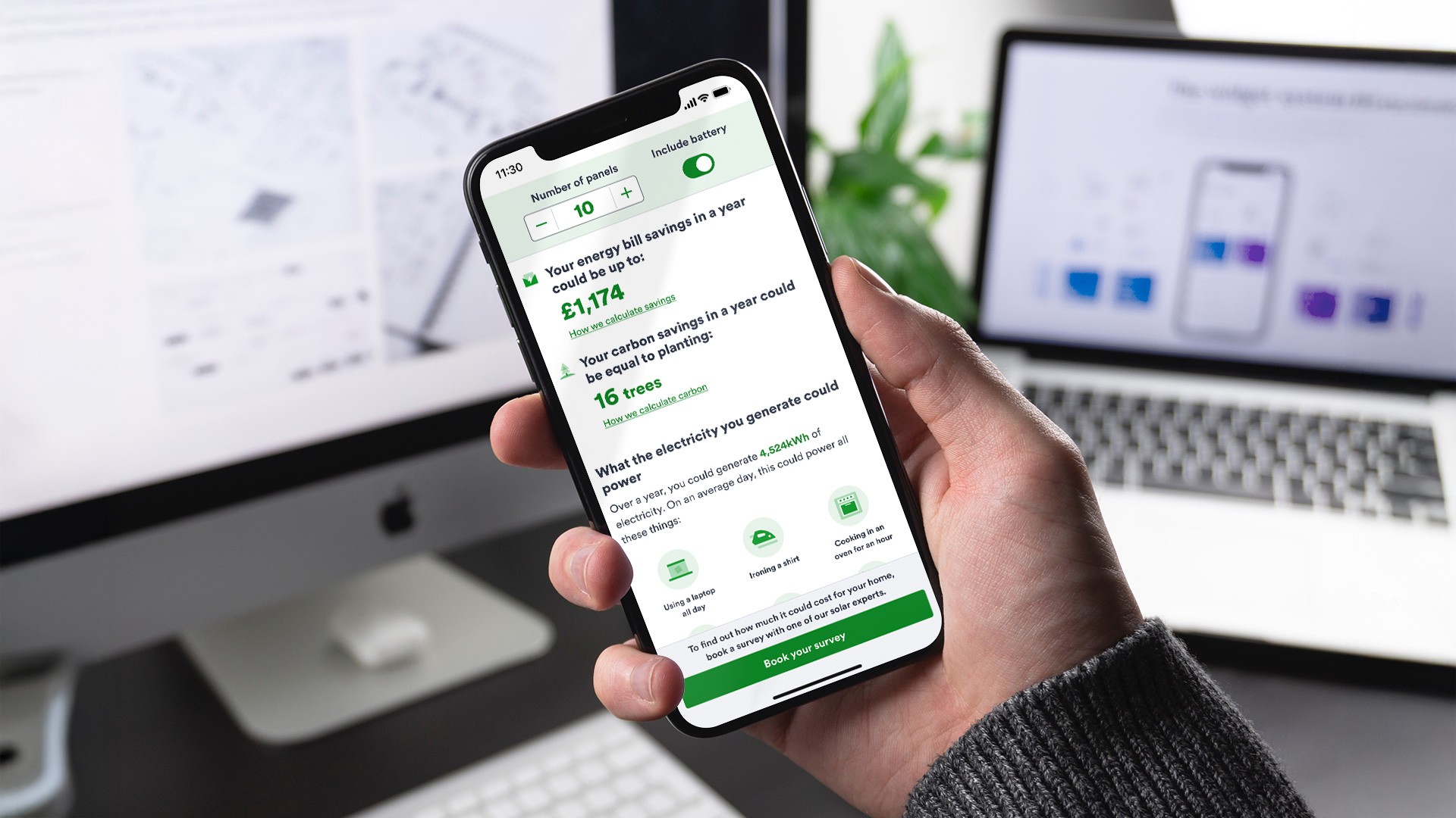
The indicative quote page went through several iterations, stripping down the noise to leave a clean, clear suggested solar package, with costs and savings based on our pricing matrix. As a key business interest, we also showed carbon savings, manifested as trees planted to align with our marketing approach.
Given the figures would be based on the average of their property type, we gave them the option to adjust their package, and allow them to explore by adding and removing panels, and toggling the inclusion of a storage battery. I explored sliders, but based on UX research settled on a simple counter component.
In order to give some clarity to the potential energy they could generate, given research revealed kilowatt hours are considered difficult to comprehend, we manifested the generated power in the form of devices and goods in the home, updating the list as the user interacted with the package options.

Cost calculator and indicative quote mobile flow
Cost calculator and indicative quote mobile flow
Cost calculator and indicative quote mobile flow
Confident with the flow, we went through another round of user testing with prototypes. Users interacted as anticipated, efficiently and with clear comprehension. Comments were noted and we created a list of iterations to review once the MVP was live.
Confident with the flow, we went through another round of user testing with prototypes. Users interacted as anticipated, efficiently and with clear comprehension. Comments were noted and we created a list of iterations to review once the MVP was live.
Confident with the flow, we went through another round of user testing with prototypes. Users interacted as anticipated, efficiently and with clear comprehension. Comments were noted and we created a list of iterations to review once the MVP was live.
Full mobile discovery flow
Full mobile discovery flow
Full mobile discovery flow
With a clear idea of the potential span in costs and savings, the customer would feel comfortable with proceeding to book a remote video survey, thereby entering the conversion funnel. Remaining pages were created and kept clean and uncluttered to again avoid friction or fatigue at this crucial stage.
With a clear idea of the potential span in costs and savings, the customer would feel comfortable with proceeding to book a remote video survey, thereby entering the conversion funnel. Remaining pages were created and kept clean and uncluttered to again avoid friction or fatigue at this crucial stage.
With a clear idea of the potential span in costs and savings, the customer would feel comfortable with proceeding to book a remote video survey, thereby entering the conversion funnel. Remaining pages were created and kept clean and uncluttered to again avoid friction or fatigue at this crucial stage.
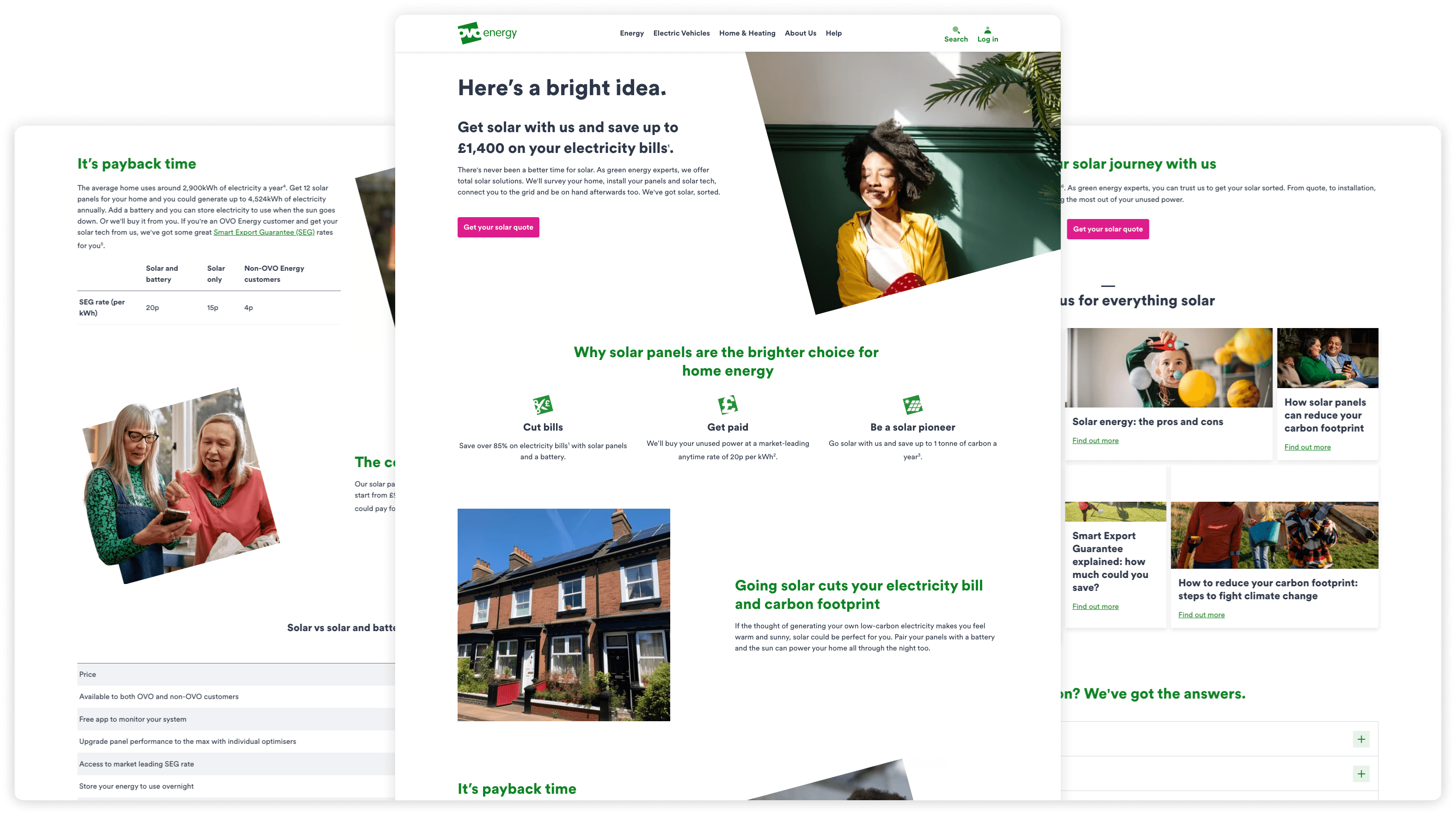
Marketing landing page designs
Marketing landing page designs
Marketing landing page designs
Framing the experience
In addition to providing guide prices and savings, I was conscious of coming back to our challenge statement and ensuring customers had reassurance by offering a good level of information. We knew we’d have a marketing-driven solar landing page to provide most of this, and to frame the experience with positive information. Alongside vital contributions from other areas of the business - marketing, retail, operations etc - the landing page content was put together.
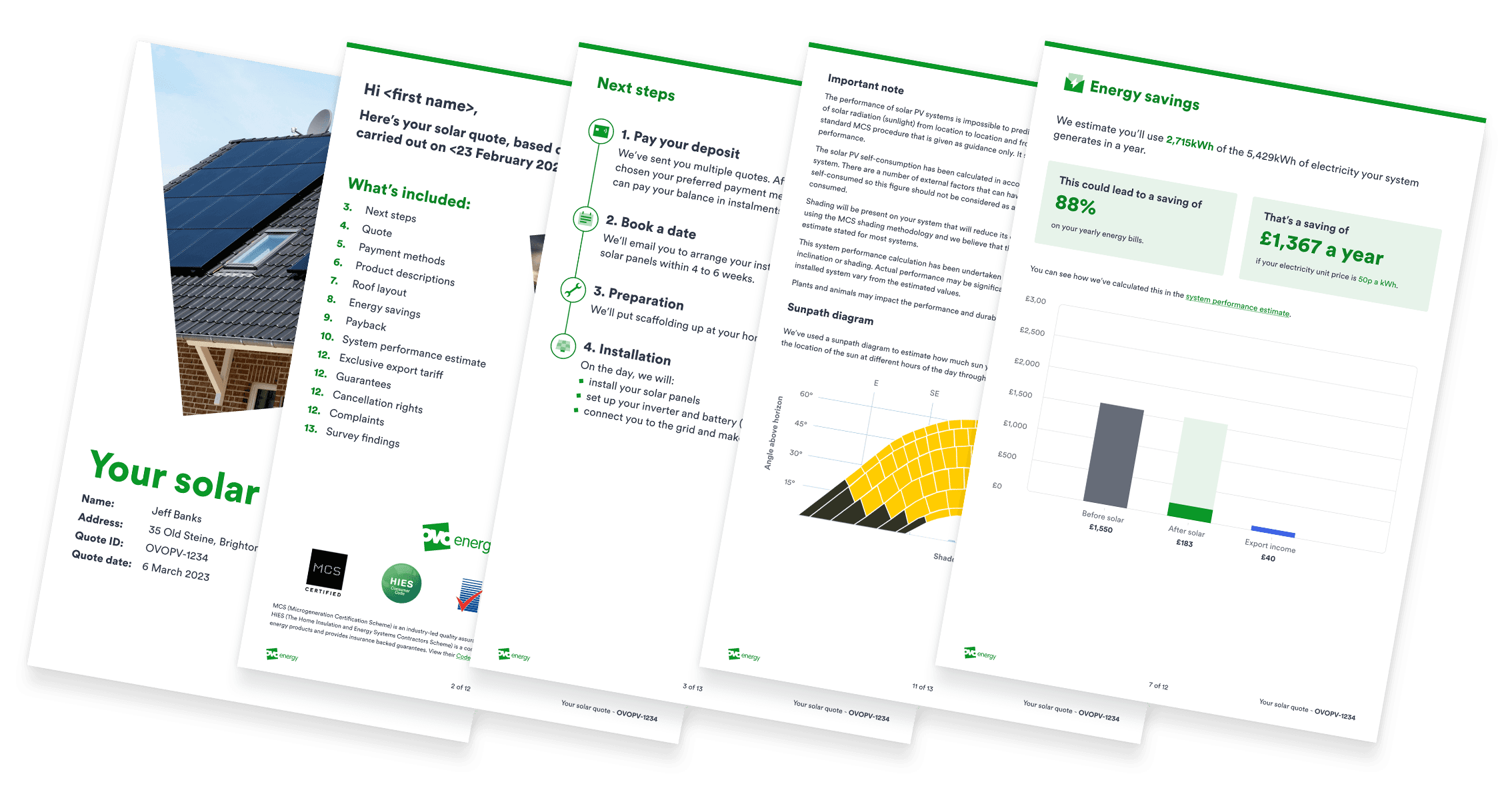
Detail from PDF quote designs
Detail from PDF quote designs
Detail from PDF quote designs
In addition to the discovery flow, I also designed the personalised full quote the customer receives post-survey, generated by a 3rd party company. The designs were reverse-engineered into their system, so a PDF could be exported in keeping with OVO style. User testing followed to ensure clarity, comprehension, and that users knew how to progress, and would be keen to do so.
In addition to the discovery flow, I also designed the personalised full quote the customer receives post-survey, generated by a 3rd party company. The designs were reverse-engineered into their system, so a PDF could be exported in keeping with OVO style. User testing followed to ensure clarity, comprehension, and that users knew how to progress, and would be keen to do so.
In addition to the discovery flow, I also designed the personalised full quote the customer receives post-survey, generated by a 3rd party company. The designs were reverse-engineered into their system, so a PDF could be exported in keeping with OVO style. User testing followed to ensure clarity, comprehension, and that users knew how to progress, and would be keen to do so.
Full desktop discovery flow
Full desktop discovery flow
Full desktop discovery flow
The payment flow was the final aspect to design - for deposit and final payment, covering all potential paths. I also designed email correspondence that sat at various points in the flow.
Handover to the software engineers itself was more linear than expected, which made for a slightly longer approvals process, ensuring our designs worked well within the platforms limitations and avoiding compromise. This could’ve been mitigated by ensuring our regular team stand-ups had a representative from their team, which was noted in a team retro and made for improved communications from that point.
Further pages in the flow were designed with the platform in mind so transition and build were smoother and the MVP version went live in the anticipated timeframe.
As a soft launch, the flow remained hidden from the OVO site and search engines, with emails being sent out to warm pots of customers who’d registered their interest. Open and click through rates were much higher than anticipated, as was the number of surveys booked. EM subject lines were A/B tested during this time, to ensure messaging was fully optimised before the landing page and discovery flow were pushed fully live mid-June, with booked-in surveys again exceeding expectations. Surveys took place, deposit payments went through, and the next phase of research and iterations began.