Making Mars B2B portal more discoverable, visible and accessible
Challenge
Mars’ internal Marketing Portal required a full overhaul - it was under-used due to poor usability, content being out of date, and searching for assets being an unfulfilling and impractical process across multiple touch points. It needed a rethink from platform all the way up to front-end UI and CMS. The many business objectives could be distilled down to a few overarching KPIs - increase traffic to the site (and in particular their BBMV section) and reduce unnecessary budget spend with better, less duplicated content.
Process
Picking up on existing discovery and research, I worked closely with the client and a partner agency for site development. I utilised my existing brand and sub-brand knowledge having worked on the account previously. I created design solutions that were tested internally to ensure they met criteria for each aspect of the portal - streamlining commonalities that existed throughout existing asset repositories.
Solution
Designs were created, approved and delivered with style guides, working through a checklist from all parties to ensure nothing was lost in translation. Good communication was crucial, with regular client and developer stand-ups. All objectives were fulfilled without major compromise as the portal was rolled out on schedule with positive feedback from client and internal testing.
Role
Lead Designer
Year
2022
Contribution
UX, UI, Prototypes
Platform
Web
Sample user persona interview
Sample user persona interview
Sample user persona interview
Discovery
I picked up and digested a strong discovery phase from our partner agency. Part of this included a series of interviews with groups of users, alongside a study of the site, it's layout, analytics and content, to relate it's main hurdles and hindrances to usage. Responses to the interviews had many commonalities; the three sectors of the business (Mars Wrigley, Mars Food, Mars Petcare) felt very separate, the portal wasn’t widely used, it didn’t feel collaborative or relevant, content was outdated. Analytics suggested users were almost exclusively browsing the portals on desktop, and tablet and mobile usage was extremely low. Research was also done on re-platforming the portal, with considerations offering on a couple of solutions, either SharePoint or Acquia which are both existing Mars strategic platforms. The decision was to go with Acquia Starter Kit, whose key strength is the ability to update designs very quickly via a Theme Configurator, which was already used for existing Mars brand sites.

Desktop wireframes
Desktop wireframes
Desktop wireframes
A full sitemap based on perceived content and a handful of lo-fidelity desktop wireframes was created, along with some initial, loose designs. The next task was to strip back the sitemap somewhat, as it had made a lot of presumptions, in particular with the way page content was structured. Additionally, the existing wireframes hadn’t focussed much on the Starter Kit modules we were due to use. So I started to look at each page, its contents, and the modules. I was familiar with Starter Kit having worked briefly on some Mars product sites, and we had access to live sites and full site designs in Figma.
A full sitemap based on perceived content and a handful of lo-fidelity desktop wireframes was created, along with some initial, loose designs. The next task was to strip back the sitemap somewhat, as it had made a lot of presumptions, in particular with the way page content was structured. Additionally, the existing wireframes hadn’t focussed much on the Starter Kit modules we were due to use. So I started to look at each page, its contents, and the modules. I was familiar with Starter Kit having worked briefly on some Mars product sites, and we had access to live sites and full site designs in Figma.
A full sitemap based on perceived content and a handful of lo-fidelity desktop wireframes was created, along with some initial, loose designs. The next task was to strip back the sitemap somewhat, as it had made a lot of presumptions, in particular with the way page content was structured. Additionally, the existing wireframes hadn’t focussed much on the Starter Kit modules we were due to use. So I started to look at each page, its contents, and the modules. I was familiar with Starter Kit having worked briefly on some Mars product sites, and we had access to live sites and full site designs in Figma.

Desktop filter mechanisms
Desktop filter mechanisms
Desktop filter mechanisms
We looked at each page template individually, and with access to brand guidelines for each sector, styles were formulated and tightened, working with live sample content or an good approximation of it. Early designs had much of the content set in embedded PDFs, but after discussions, it was felt we needed to structure that content within our page templates, in order to achieve the required levels of usability.
We looked at each page template individually, and with access to brand guidelines for each sector, styles were formulated and tightened, working with live sample content or an good approximation of it. Early designs had much of the content set in embedded PDFs, but after discussions, it was felt we needed to structure that content within our page templates, in order to achieve the required levels of usability.
We looked at each page template individually, and with access to brand guidelines for each sector, styles were formulated and tightened, working with live sample content or an good approximation of it. Early designs had much of the content set in embedded PDFs, but after discussions, it was felt we needed to structure that content within our page templates, in order to achieve the required levels of usability.
Desktop filter prototype
Desktop filter prototype
Desktop filter prototype
The content was pretty vast, but once I’d spent some time honing in on a few suitable key modules, on some of the more generic pages body content started to fall into place nicely.
A bigger challenge was how we were to present sets and subsets of content. With the large quantity of content to fit into the pared down site menu, we needed workable and consistent methods of breaking down that content, and showing a clear overview of each pages sections at the top. Trying a few methods across various pages, we concluded a tab and filter mechanism would be most suitable.
Every page design template was prototyped so the client could test and see exactly how functions like the tabs and filters would work, with two sample brands having precise live content added. Internal usability tests were held so we could iterate and apply to each subsequent page where relevant.
With the initial user research very much in mind, we designed the Search page to house results from their DAM systems which provide associates with everything they need in their day to day roles.

Icon designs
Icon designs
Icon designs
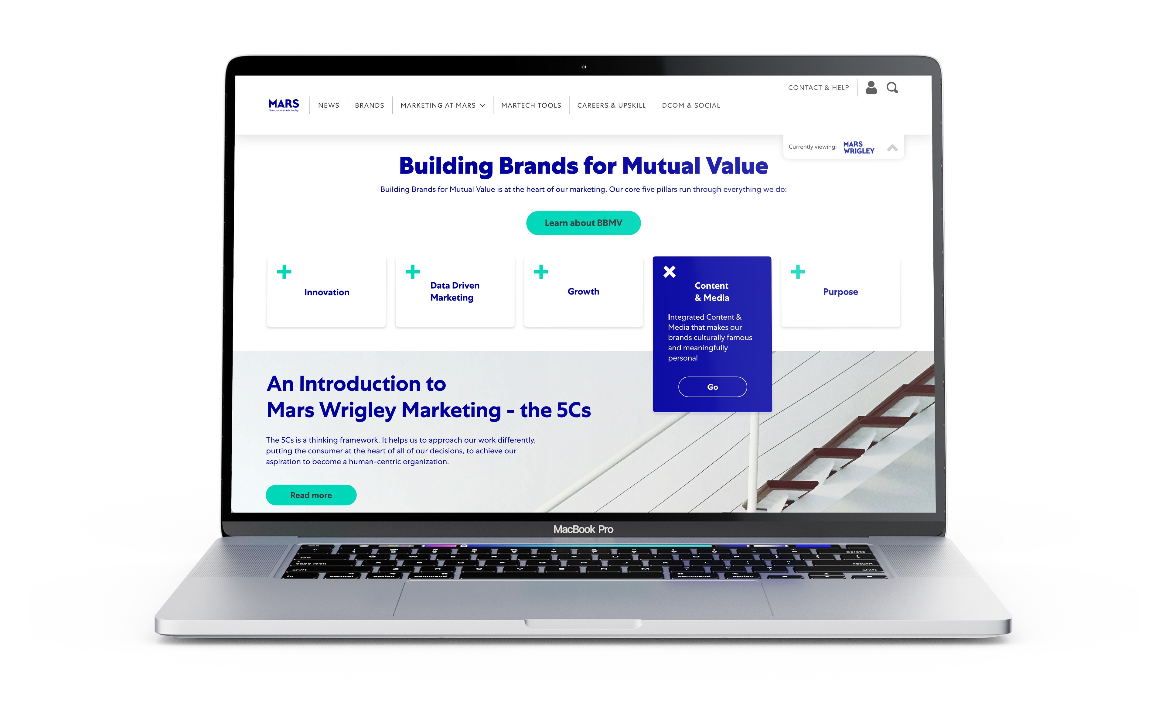
Mars BBMV marketing section (Building Brands for Mutual Value) was regularly referenced in initial objectives and interviews as something that needed to be front and centre on the site, representing the five core pillars that run through everything they do. We paid particular focus to this in-depth section and its unique section so content, ensuring we had a full representation of live content with which to use in designing templates. Additionally I created some icons to help communicate some of the content.
Aforementioned Brand pages were a nice little side-step in the full process. The client was keen to reflect the individuality of each brand by having unique styling on their relevant pages. Having reviewed playbooks and brand guidelines for Skittles, Snickers, Whiskers and many more, I was able to source colour schemes that represented each brand without straying from accessibility standards. While the client was keen to change typefaces too, the unsuitability of this idea was explained and fortunately vetoed. Ultimately we managed to get the feel, flavour and individuality of a brand across without raising inconsistency and usability concerns.

Desktop news index page with personalised tagging
Desktop news index page with personalised tagging
Desktop news index page with personalised tagging
One further major challenge was the News section. A common criticism of portal news was content felt ‘outdated and irrelevant’, and content categorisation was ‘not effective’. The challenge was two-fold; allow users to personalise their news feed to some degree, and present this news effectively alongside mandatory articles. Taking their old user profile page as starting point, I devised an accessible, updatable slide-out mechanism that enabled the user to view and amend their selected segment, brand and article tags. This was cross-referenced at article level, where the user could add or remove tags pertaining to the article itself, thereby controlling their content based on content as well as broader brand or sector tags. The news index page was a BBC News influenced wealth of personalised content within a solid and focussed structure.
One further major challenge was the News section. A common criticism of portal news was content felt ‘outdated and irrelevant’, and content categorisation was ‘not effective’. The challenge was two-fold; allow users to personalise their news feed to some degree, and present this news effectively alongside mandatory articles. Taking their old user profile page as starting point, I devised an accessible, updatable slide-out mechanism that enabled the user to view and amend their selected segment, brand and article tags. This was cross-referenced at article level, where the user could add or remove tags pertaining to the article itself, thereby controlling their content based on content as well as broader brand or sector tags. The news index page was a BBC News influenced wealth of personalised content within a solid and focussed structure.
One further major challenge was the News section. A common criticism of portal news was content felt ‘outdated and irrelevant’, and content categorisation was ‘not effective’. The challenge was two-fold; allow users to personalise their news feed to some degree, and present this news effectively alongside mandatory articles. Taking their old user profile page as starting point, I devised an accessible, updatable slide-out mechanism that enabled the user to view and amend their selected segment, brand and article tags. This was cross-referenced at article level, where the user could add or remove tags pertaining to the article itself, thereby controlling their content based on content as well as broader brand or sector tags. The news index page was a BBC News influenced wealth of personalised content within a solid and focussed structure.

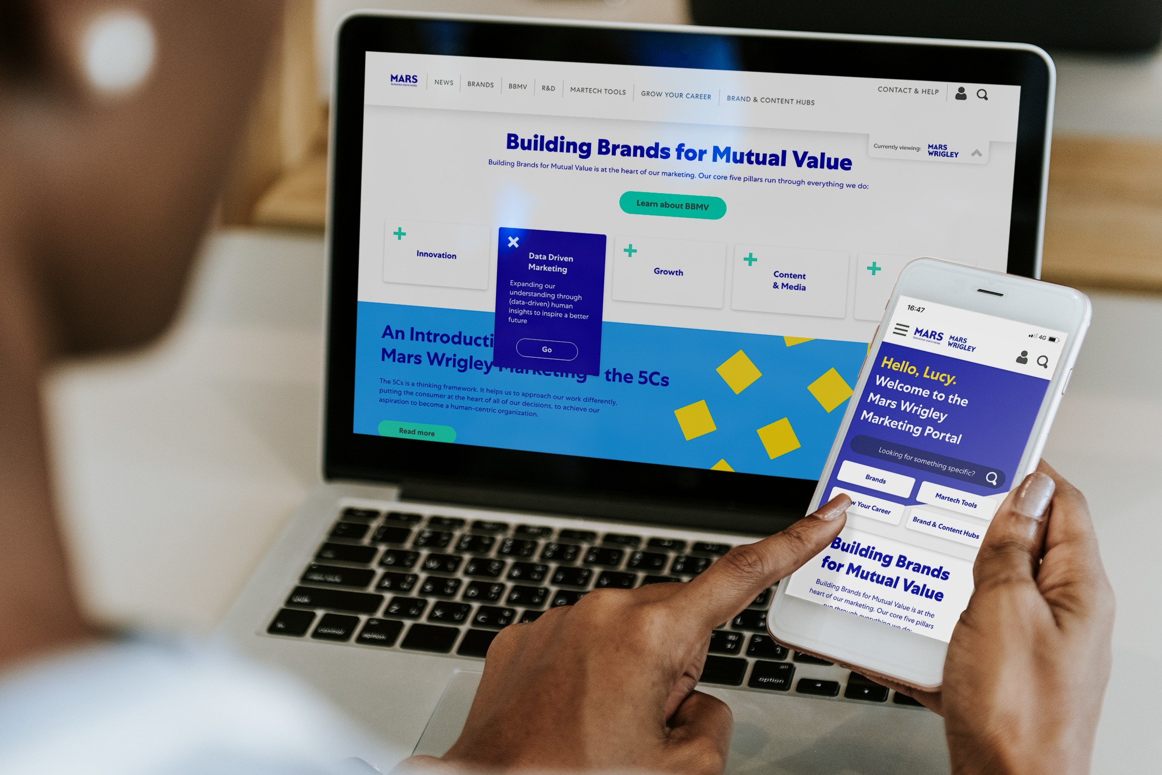
Mobile design detail
Mobile design detail
Mobile design detail
While the portal was very much intended as a desktop-first experience, the mobile version still required a fair amount of focus. While some modules responded gracefully, other bespoke aspects needed to be logically designed. I decided on a balance of horizontal filter and content sliders and standard vertical scrolling. No content or interactivity was compromised and prototypes responded well to tests.
We worked with a partner agency for site development, delivering style guides and designs in XD as required, working through a checklist from all parties to ensure nothing was lost in translation. They took full control of the CMS creation - another crucial business objective to fulfil.
A great long-term project with a really solid team. Good communication was crucial, particularly having started up my role after initial discovery phases. Regular client stand-ups really helped things progress, and ultimately objectives were fulfilled without major compromise.