Clenergy EV Driver's app new user
Encouraging and enabling guest users to register an account with ease

Challenge
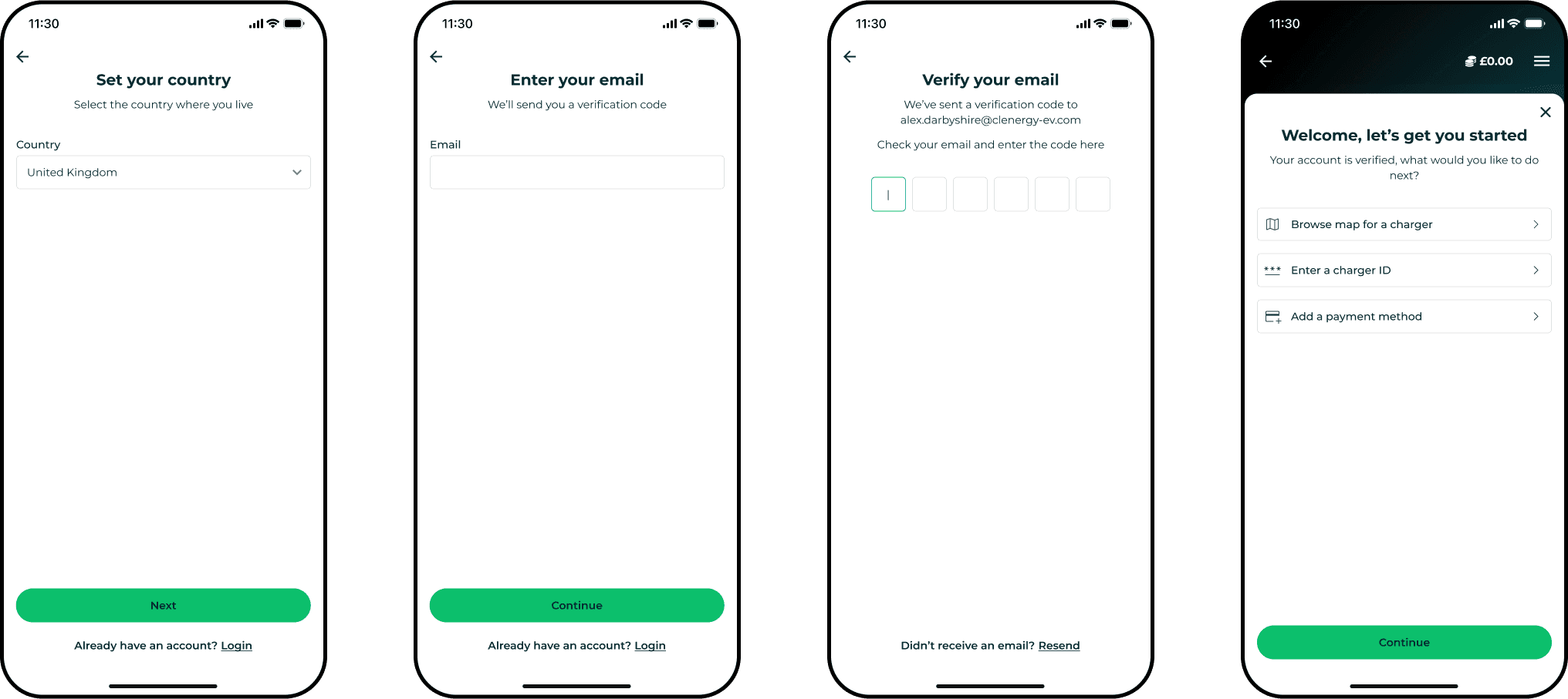
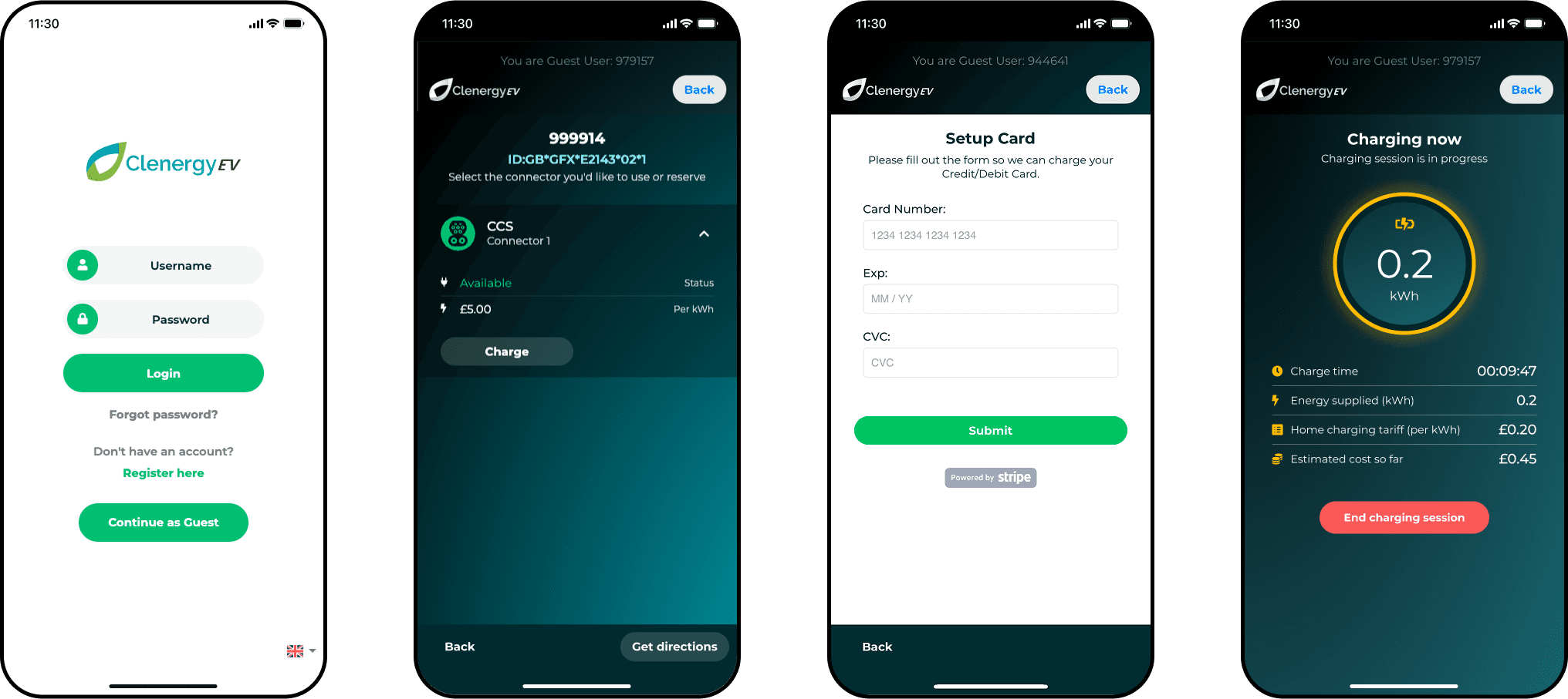
I worked at Clenergy EV, a startup EV charge point management software company, as their sole product designer, across their driver's app and owner's admin portal. Allowing drivers to charge their EV with the app as a guest is essential to the user experience, giving the option to start charging quickly and easily. Despite that, there are benefits for both the business and the driver for them to register an account, and conversions were low. Given the two user flows are intertwined, the task was to update both so they fulfilled their purpose as much as possible.
Process
I audited the existing guest and new user flows, which uncovered usability issues and offered opportunity to improve and enhance, and carried out competitor analysis and researched flows from other sectors to reveal design pattern commonalities. While a full overhaul was out of scope, the potential to update key screens and improve UX aspects was clear.
Solution
I designed updated flows for the full guest experience, and conversion to new user registration, both stemming from an updated landing screen. While being restricted to how far I could push things due to time and resource, I managed to introduce improved usability patterns, and took the opportunity to bring in a few new elements from a brand update that had recently been rolled out to the company's marketing website.
Role
Senior Product Designer
Year
2024
Contribution
UX, UI, Design System, Prototypes, Research
Platform
Web, app
Discovery
Clenergy's admin tool showed that the number of users converting from guest to fully registered accounts was low. Being a guest offered the user the chance to instantly find a charger, so that aspect of the experience couldn't be much quicker. But it was visibly clear that the alternatives to guest charging were only shown on the initial landing page, and the benefits of which weren't highlighted at all.
If a driver did decide to register during this flow, the process was convoluted. Additionally there was no prompt to encourage the user to register at any stage, whether literally or by the confused weighting of the UI options on the landing page. This discovery clearly highlighted that the landing page was a source of friction, as the presentation of UI options increased cognitive load on the user.
Reviewing the inherited designs in depth, it confirmed there were issues with continuity, with multiple versions of some components, further affecting streamlined user experiences.
Ideas had to be sold in to stakeholders to justify the work, so I put together a presentation piece, showing the various flows that stemmed from the landing page. This gained the approval, albeit with some restrictions, mainly for time and technical reasons.